An Honest review of Pantone’s Color of the Year
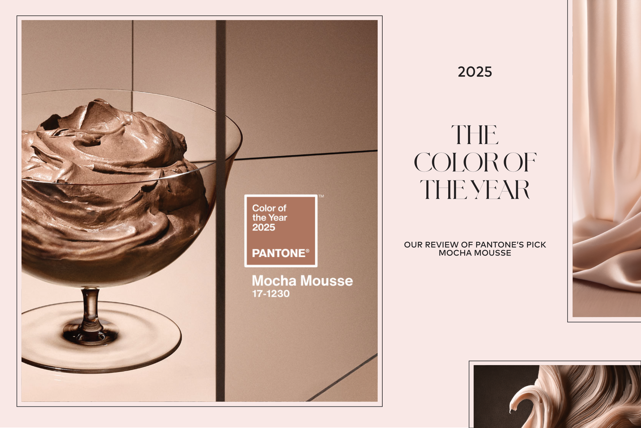
Another year, another controversial pick for Color of the Year by Pantone. The chatter about this year’s choice ranges from those who claim the color is “boring” to others saying it should have been a more contrasting color from last year. I, however, think it was a great pick and here’s why.
A warm neutral shade
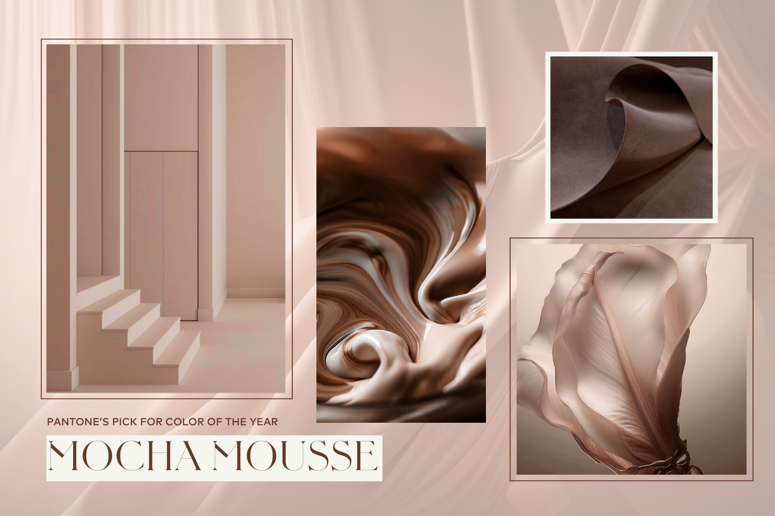
This year we are presented with Mocha Mousse, a light chocolatey brown with a warm undertone. Pantone described this year’s color as “a warming, brown hue imbued with richness. It nurtures us with its suggestion of the delectable qualities of chocolate and coffee, answering our desire for comfort.”
At first glance, this year’s color may look a little dull, but I actually think it has a lot of versatility when it comes to using it in design. It follows one of the design trend predictions I made, leaning into more nature inspired hues. We are moving away from cool neutrals (grays, cool whites) and embracing colors with a richer and warmer undertone.
I love how this color works really well with a large range of hues and tones. It is not the star of the color palette, but it works beautifully to enhance the other colors in the space. It has a nice mix warm and cool undertones that blend well with the other colors in the space.
How to use Mocha tones in Architecture
Architecture is not a field where you can adopt trends, especially those that come and go in less than a year. However, I do think that if you were this color can be added in architecture projects in a way that would outlast the trend factor and create a timeless feel. In the studio, I strive to find a balance of contemporary and classic in all my projects so they can feel current for many years to come. If you need help achieving this in your project please send me a message and I would be glad to help you.
We add a touch of the Mocha Mousse palette in your project use natural materials such a wood, preferably stained in a neutral/ash tone. Stay away from cherry, or any stain with a red tint. Use stone with warm browns and rose tones. Terra cotta tiles fit well into the Mocha range and are a great options to bring warmth and personality to a project.
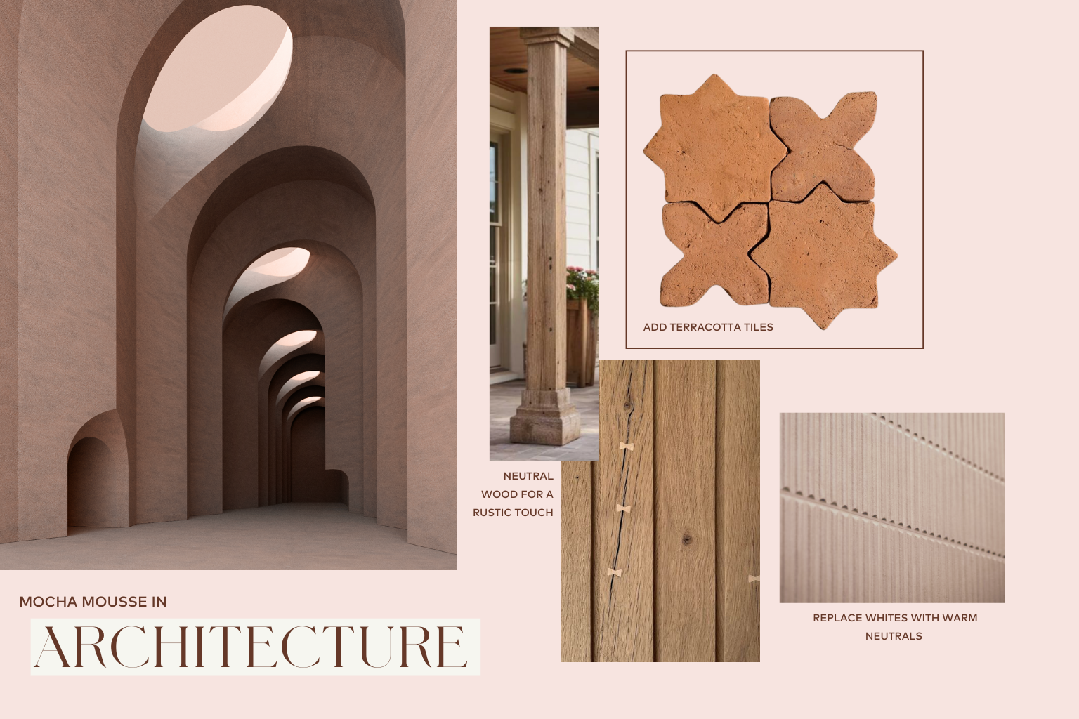
I would also use this color on exterior window trims and doors. This would be a refreshing departure from white exterior walls with black frames that are starting to look dated. I would opt for a darker tone of Mocha Mousse palette, to still give the frames a rich contrast against the exterior walls.
How to use Mocha Mousse in Interior design
In interiors is where Mocha Mousse really starts to shine. This color will look great on upholstered furniture, millwork and walls. It’s not a color that is overpowering on large surfaces but will guide the overall direction of the color palette in the space. This is ideal for rooms where you don’t want to go with white walls but you do still want to keep it fairly neutral throughout.
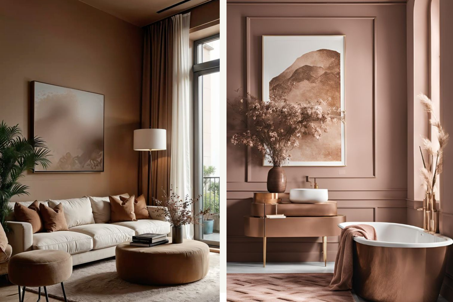
For furniture, lean into the darker tones of the mocha mousse range. On walls and millwork use more rosy pink hues that are in the undertone.
This is a great color for accent elements such as rugs, throw pillows and even decor elements, the possibilities are endless.
Mocha Mousse is the new black in Fashion
Mocha Mousse goes quite well with most skin tones and is a great option for fashion. Lean into the more dusty pink tones if you have darker skin, and the more chocolate brown if you are lighter. The versatile nature of this color makes it really easy to pair this color with almost everything you own and can be a great alternative to black.
Monochromatic looks are also trending this year. Keep it interesting by using different shades of the same color. This will automatically make you look put together and styled.
How incorporate Mocha Mousse in beauty looks
Browns have been trending in the beauty space for a while, “cappuccino makeup” is all over Pinterest, so chances are you already have a lot of options to incorporate Mocha Mousse colors into your makeup looks.
The way to pull this off is keeping your eyes simple and using shades of brown for a soft smoky eye look. Switch to brown mascara, to enhance length but keep the eyes soft. On the cheeks focus on soft contouring in a cool brown tone and highlighting with a rose color highlighter. This combination of cool brown with a warm rose will give the same beautiful effect that the Mocha Mousse color exudes.
For lips opt for a balm like the summer Fridays Balm in Iced Coffee over a pink nude lip. My go-tos are Mac cult classic Velvet Teddy lipstick, and the lip pencil in Spice.
I would love to hear your thoughts on Pantone’s pick for color of the year, do you think Mocha Mousse was a good choice? Let me know how you will be using it or what would have been your color choice instead.
Disclosure: This post contains affiliate links this means that if you buy something through my links, I may earn an affiliate commission at no cost to you. Thanks for your support.